Landing pages are often created when a marketing campaign is in the works. Various ads, amongst other campaign elements, drive the target audience to a designated webpage with the goal of raising overall awareness or generating a qualified lead, client/customer/member, or conversion. In this article, we’ll review the key elements of a landing page as well as provide additional readings for detailed information and reference.
USER EXPERIENCE
First and foremost, we have what we’ll refer to as user experience. This idea encompasses everything from search engine optimization (SEO) to accessibility options to how your content is presented. If your landing page doesn’t hold up to each industry standard it will simply underperform, leading to a high bounce rate (i.e., a user lands on the page and takes no further action).
This is where an SEO and web development team come into play. They are each an integral part of creating and maintaining an effective landing page. From optimizing images to mobile friendliness, they’ll ensure the consumer has no reason to leave your page before it loads.
We have a free-to-access eBook available that reviews all facets of Quantifying User Experience.
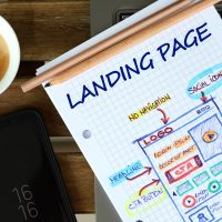
HEADLINE, HERO IMAGE, AND VISUALS
Following user experience, your headline, hero image, and visuals will also have a significant impact on your landing page’s effectiveness. According to a post by HubSpot, the average landing page bounce rate across all industries is 47%. If you’re in the B2B industry, you’re against even worse odds, with an industry average of 75%.
With these alarmingly high statistics going against you, your headline, hero image, and visuals need to be the driving force that creates conversions. It takes consumers less than three seconds to make the decision whether to bounce or continue browsing; do not hesitate to invest in these elements.
This is where a designer or team comes into play, heavily. They’ll create the gripping hero image, visuals, themes, and logo that express your brand’s image consistently and entirely.
Our eBook, Brand Attraction, will provide additional information on this topic.
NEGATIVE SPACE AND EXCESS NAVIGATION
Negative space is simply the space between design elements. Using negative space correctly often means directing the consumer’s eyes to the call-to-action (CTA) (e.g., making an appointment, form submissions, enrolling, account creation, etc.). Your landing page should not be a bank of information, data, or visuals. Remember, the purpose of your landing page should be to create leads, clients/customers/members, or conversions. Any additional navigation, even internal links to your website, will only dilute the consumer’s options and create additional points of bouncing.
More on negative space, including live examples, can be found in this post by unbounce.
CALL-TO-ACTION LANGUAGE AND METHOD
The language you use and the CTA itself are two more impactful elements of a landing page. Market research will provide insights into how your target audience consumes media and engages with a CTA.
The language the CTA uses is equally important as the CTA itself. “Sign Up Now”, “Shop Here”, “Become a Member Today”, and so on, the language should reflect your brand and your brand values, as well as the campaign goals.
TRUST INDICATORS
Lastly, we have trust indicators. Customer testimonials, statistical evidence, awards won, reviews, and even company information all affect your landing page’s success. Now more than ever, consumers are seeking brands that are trustworthy, something we detail in our Marketing Post COVID blog post.
Channel Communications has deep experience in creating meaningful, unique, and successful campaigns for organizations and enterprises across a wide variety of industries. Interested in seeing our work? Visit our Creative page to learn more or call President Cory Farrugia at 410-296-0697.